After a few years of freelancing, I was offered a postion with one of my long-term clients -- Human Rights First. I worked with the organization full-time for over two years until early 2025, when I decided to pursue freelancing again.
I felt like I had abandoned my brand and decided it needed some love. Who was I this time around? What personality did I want my brand to have?
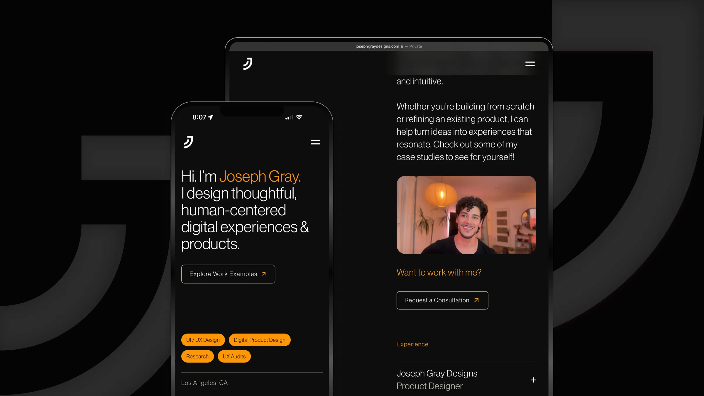
Well... It's me, so I wanted it to represent that! I'm a friendly, down to earth person. I like things that are new and shiny, but I also appreciate nostalgia. I need things to feel minimal, but also warm and cozy. I think my new brand does just that!
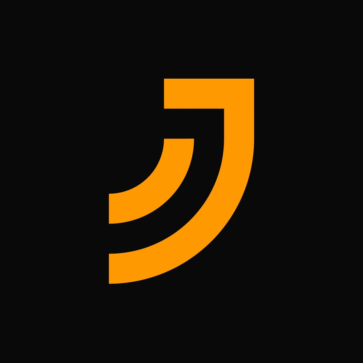
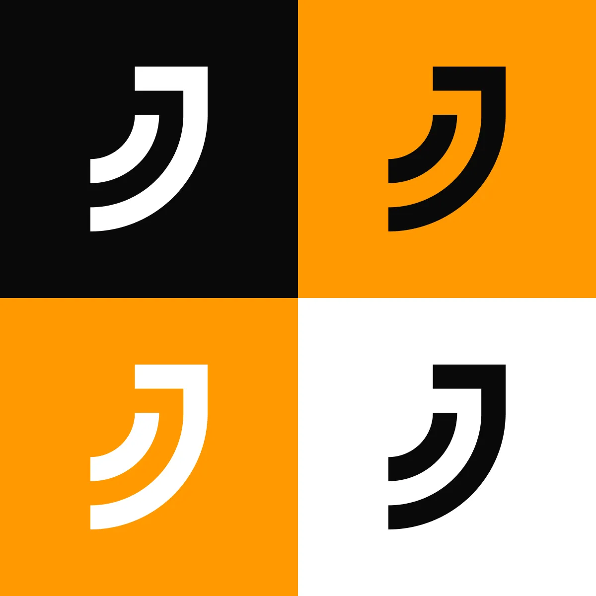
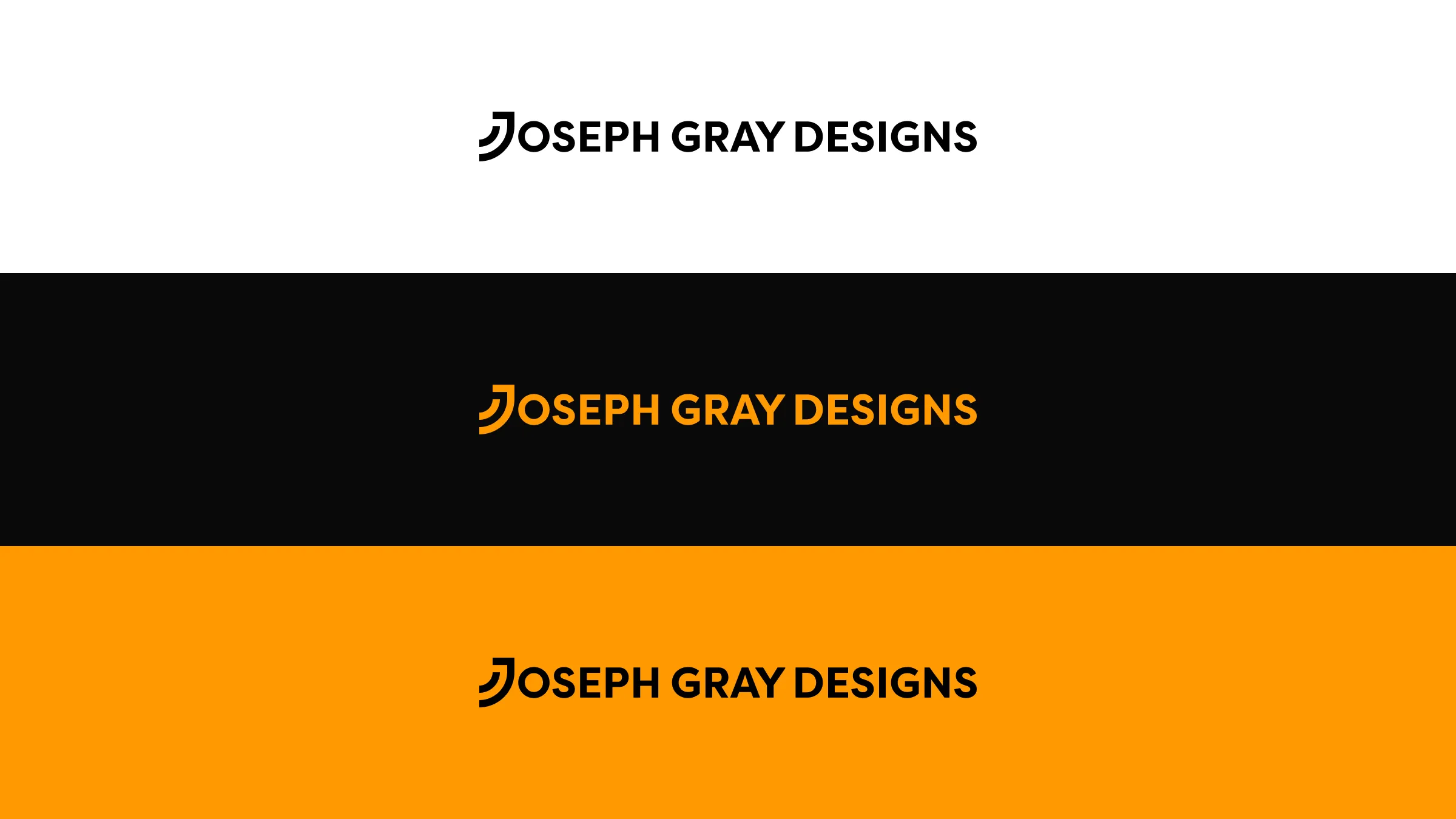
I like playing with shapes, weights, and textures... So I re-introduced curves and use different line weights on my website and logo. It makes it feel more friendly.
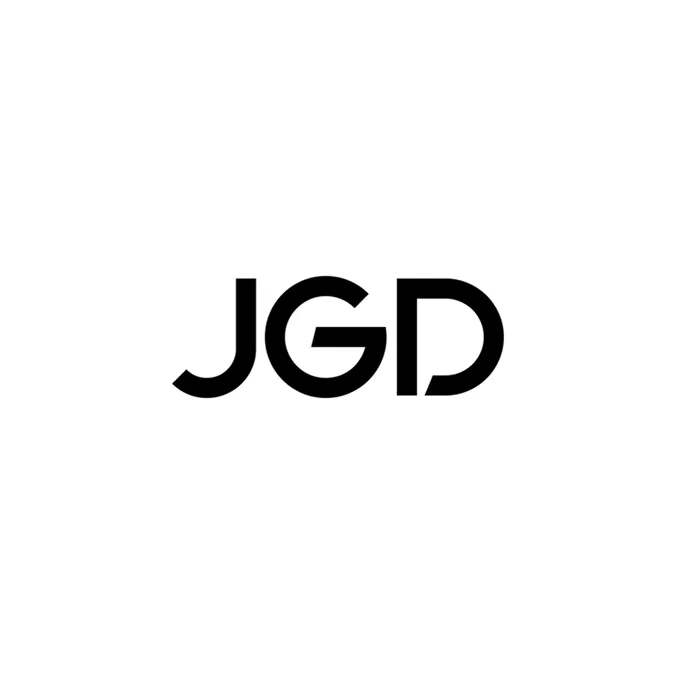
The V2 monogram was supposed to be JGD, nested within each other. Over the years and doing user research, I learned people didn't see it and thought it looked like a QR code. So, I redesigned my logo completely. Now, the monogram is easier to uderstand and is integrated into the full logo, so it's easily recognizable by itself and together.
I updated the accent color from yellow to a more cozy shade and chose a new typeface for my site as well. Put all of these elements together and you get a modern, yet retro vibe.